 Back to resources
 Drupal
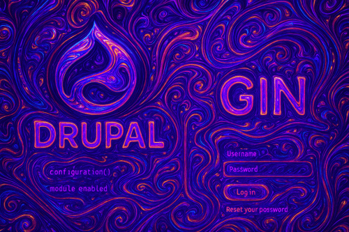
How to Customize Login and Registration Pages in Drupal with the Gin Login Module

Your Drupal site's login page is often the first thing users see when accessing protected content or admin areas. A generic, unstyled login form can feel disconnected from your brand and create a poor first impression. The Gin Login module offers a straightforward way to customize these critical pages without diving into complex theming or custom module development.
This guide walks you through setting up and customizing the Gin Login module for Drupal 11, from basic configuration to advanced template overrides. You'll learn how to add custom branding, adjust layouts, and create a polished authentication experience that matches your site's design.
Prerequisites
Before starting, you'll need:
- Drupal 11 installation (Gin Login also works with Drupal 9 and 10)
- Composer access for installing modules
- Admin permissions to install modules and configure themes
- Basic understanding of Drupal's admin interface
Optional but helpful:
- Custom logo and background images ready for upload (PNG, JPG, or SVG format)
- Brand colors in hex format for button and field customization
- Basic CSS knowledge if you plan to add custom styles
We've found that having your branding assets prepared beforehand saves significant time during configuration. Teams often underestimate how much a properly branded login page improves user trust and perception.
Step-by-Step Implementation for Drupal Login Customization
Step 1: Install Required Components
First, install both the Gin admin theme and the Gin Login module using Composer:
composer require drupal/gin drupal/gin_login
If you encounter dependency issues, specify versions explicitly:
composer require drupal/gin:^4.0 drupal/gin_login:^2.0
After installation, enable both components through Drupal's admin interface:
- Navigate to Appearance (/admin/appearance)
- Find the Gin theme and click "Install and set as default" for the administration theme
- Go to Extend (/admin/modules)
- Search for "Gin Login" and check the box
- Click "Install" at the bottom of the page
Step 2: Access Gin Login Configuration
Once installed, the configuration page becomes available at:
Configuration → User Interface → Gin Login settings
(/admin/config/user-interface/gin-login)
The settings page presents several customization options organized into logical sections. Take a moment to explore each section before making changes.
Step 3: Configure Basic Branding
Start with the essential branding elements:
Logo Upload:
- Click "Choose file" under the Logo section
- Select your logo file (recommended: transparent PNG, max width 300px)
- The logo automatically appears on all authentication pages
Background Configuration:
You have three options for backgrounds:
- Solid color: Enter a hex code (e.g., #1e3a5f)
- Custom image: Upload your own background (minimum 1920x1080 recommended)
- Random wallpapers: Enable the built-in wallpaper rotation feature
Form Layout:
Choose between:
- Centered: Form appears in the middle of the screen
- Left-aligned: Form positioned on the left with background on the right
Step 4: Apply Color Scheme
The Gin Login module respects your brand colors through several settings:
/* These settings translate to CSS variables you can reference */
--gin-color-primary: #0074bd;  /* Button backgrounds */
--gin-color-primary-hover: #005a94;  /* Button hover states */
--gin-color-focus: #0074bd;  /* Focus outlines */
Set these colors in the "Branding Colors" section of the configuration page. The changes apply immediately to:
- Submit buttons
- Links
- Form field focus states
- Loading indicators
Step 5: Add Custom CSS for Fine-Tuning
For specific adjustments beyond the standard options, use the Custom CSS field:
/* Round the corners of the login form */
.gin-login__form {
  border-radius: 12px;
  box-shadow: 0 8px 24px rgba(0,0,0,0.12);
}

/* Adjust logo size */
.gin-login__logo img {
  max-width: 200px;
  height: auto;
}

/* Customize input fields */
.gin-login__form input[type="text"],
.gin-login__form input[type="password"] {
  border: 2px solid #e0e0e0;
  padding: 12px;
  font-size: 16px;
}

/* Style the submit button */
.gin-login__form .button--primary {
  padding: 14px 24px;
  font-weight: 600;
  text-transform: uppercase;
  letter-spacing: 0.5px;
}
Step 6: Implement Advanced Customizations
For deeper modifications, you'll work with template overrides and custom modules.
Template Override Method:
1. Copy the template file from:
modules/contrib/gin_login/templates/gin-login-page.html.twig
2. Place it in your custom theme:
themes/custom/yourtheme/templates/gin-login-page.html.twig
3. Modify the template structure:
{# Add a custom welcome message #}

{{ 'Welcome to Our Platform'|t }}

{{ 'Please sign in to continue'|t }}


{# Original form rendering #}
{{ form }}
Custom Module Method:
Create a custom module to alter the login form programmatically:
// In mymodule.module file

/**
 * Implements hook_form_FORM_ID_alter() for user_login_form.
 */
function mymodule_form_user_login_form_alter(&$form, \Drupal\Core\Form\FormStateInterface $form_state, $form_id) {
  // Add placeholder text
  $form['name']['#attributes']['placeholder'] = t('Email or username');
  $form['pass']['#attributes']['placeholder'] = t('Password');

  // Add custom validation
  $form['#validate'][] = 'mymodule_user_login_validate';

  // Add a custom class
  $form['#attributes']['class'][] = 'branded-login-form';
}

/**
 * Custom validation for login form.
 */
function mymodule_user_login_validate(&$form, \Drupal\Core\Form\FormStateInterface $form_state) {
  $username = $form_state->getValue('name');

  // Example: Block certain domains
  if (strpos($username, '@blocked-domain.com') !== false) {
    $form_state->setErrorByName('name', t('Access denied for this domain.'));
  }
}
Common Mistakes to Avoid
Our experience shows that developers often encounter these issues when customizing login pages:
1. Forgetting to Clear Cache
After making configuration changes or adding custom CSS, always clear Drupal's cache:
drush cr
Without this step, your changes might not appear.
2. Using Low-Resolution Images
Background images should be at least 1920x1080 pixels. Smaller images will look pixelated on high-resolution displays. Similarly, logos should be exported at 2x resolution for retina displays.
3. Ignoring Mobile Responsiveness
Test your customizations on mobile devices. The Gin Login module is responsive by default, but custom CSS might break this. Use media queries:
@media (max-width: 768px) {
  .gin-login__form {
    padding: 20px;
    margin: 10px;
  }
}
4. Overriding Too Much
The Gin Login module handles accessibility features like focus states and ARIA labels. When adding custom CSS, avoid removing these important elements:
/* Bad - removes focus indication */
.gin-login__form input:focus {
  outline: none;
}

/* Good - customizes while maintaining accessibility */
.gin-login__form input:focus {
  outline: 2px solid #0074bd;
  outline-offset: 2px;
}
5. Not Testing All Authentication Pages
Remember to check:
- /user/login - Login page
- /user/register - Registration page
- /user/password - Password reset page
- /user/logout - Logout confirmation
Each page should reflect your customizations consistently.
Testing and Verification
After implementing your customizations, run through this verification checklist:
Visual Testing
- Check all authentication pages in both logged-out and logged-in states
- Test on multiple browsers (Chrome, Firefox, Safari, Edge)
- Verify mobile responsiveness using browser dev tools or actual devices
- Confirm dark mode works if enabled (Gin supports automatic dark mode)
Functional Testing
- Complete a full login flow from start to finish
- Test password reset functionality
- Try registering a new account if registration is enabled
- Verify form validation messages display correctly
Accessibility Testing
- Navigate using only keyboard (Tab, Enter, Escape keys)
- Test with a screen reader if possible
- Check color contrast ratios (should be at least 4.5:1 for normal text)
- Verify focus indicators are visible on all interactive elements
Performance Testing
- Check image file sizes (backgrounds should be under 500KB)
- Test page load speed using browser dev tools
- Verify CSS isn't blocking page rendering
Here's a simple test script you can add to your custom module:
/**
 * Test login page customizations are working.
 */
function mymodule_test_login_customizations() {
  $tests = [];

  // Check if Gin theme is enabled
  $admin_theme = \Drupal::config('system.theme')->get('admin');
  $tests['gin_theme'] = ($admin_theme === 'gin');

  // Check if Gin Login module is enabled
  $module_handler = \Drupal::moduleHandler();
  $tests['gin_login_enabled'] = $module_handler->moduleExists('gin_login');

  // Check if custom logo exists
  $config = \Drupal::config('gin_login.settings');
  $logo_path = $config->get('logo.path');
  $tests['custom_logo'] = !empty($logo_path);

  // Output results
  foreach ($tests as $test => $result) {
    $status = $result ? 'PASS' : 'FAIL';
    \Drupal::messenger()->addMessage(t('@test: @status', [
      '@test' => $test,
      '@status' => $status,
    ]));
  }
}
Conclusion
The Gin Login module provides a practical way to create professional, branded authentication pages in Drupal without extensive custom development. By following this guide, you've learned how to install, configure, and customize the module to match your brand requirements.
The key points to remember are: start with the built-in configuration options before writing custom code, always test your changes across different devices and browsers, and maintain accessibility standards even when applying custom styles. Working with teams has taught us that a well-branded login experience significantly impacts user perception and trust.
If you're planning to implement custom login pages for multiple Drupal sites or need help creating a consistent authentication experience across your digital properties, we can help you develop a reusable configuration that speeds up future deployments while maintaining your brand standards. Contact us to discuss your specific authentication requirements and how to best implement them using Gin Login or custom development approaches.